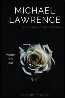
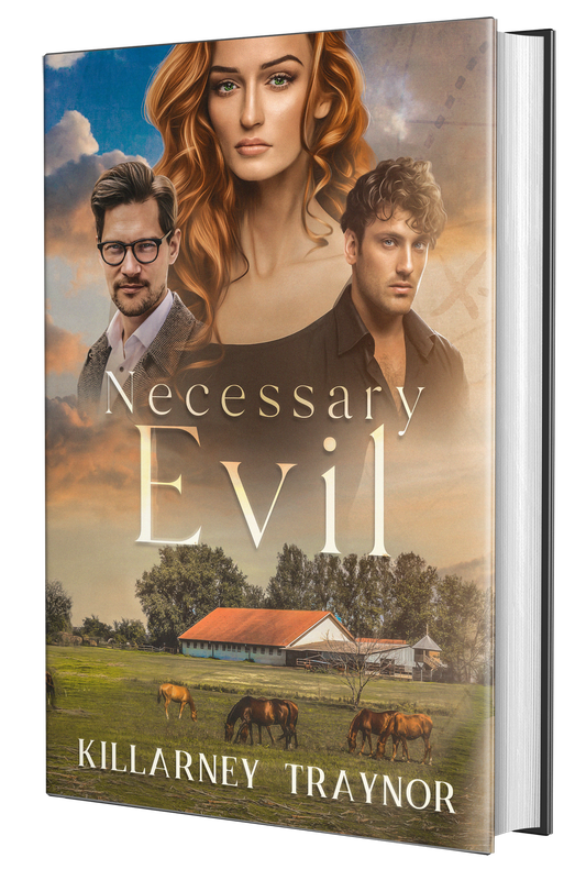
 I've always been a bit of a DYI person. Not that I'm the type that makes my own cheese (though it's on my to-do list) or swaps out transmissions or anything intense like that. But when it comes to publishing and writing, I generally find myself trying to do everything. Sometimes I have great results. Sometimes it's more of a 'Lesson Learned' thing. Making my own cover for Michael Lawrence: the Season of Darkness was one of the latter. Don't get me wrong - I love this cover (the colors! the rose! the intrigue! Isn't it pretty?)! But over the course of the months, going to different live events, I got some feedback that made me realize that I have many things to learn about graphic design. Here are a few, which I now gladly share with you! 1: SIZING THE TYPE Intention: The Season of Darkness is intended as the start of a small series, so I made the main character's name big, as it's the title of the series. Result: Almost everyone has assumed that Michael Lawrence is the author. It's only when they squint that they see my name. Unlike Laura Holt's attempt to drum up business, putting a man's name on my book hasn't helped sales, alas! Conclusion: Make sure the author's name is large enough to see to deflect confusion. Also, when I re-do this cover, I'll probably be listing it as 'The Season of Darkness: a Michael Lawrence mystery'.  The Movie Tie-In Cover The Movie Tie-In Cover 2. THE ROSE Intention: In the language of flowers, the white rose stands for marriage (among other things) and I thought this rose, threatened by encroaching darkness and shadow, represented Michael's marriage problems pretty well. #deepermeaning, am I right? Result: Turns out, when most people see a rose, they think 'romance' - regardless of color (several would-be readers thought fantasy romance when they saw my rose). In contrast, the movie tie-in cover, with the two leads looking like British detectives having a stressful day, was instantly recognizable as what it was: an American murder mystery. Conclusion: Don't try to be too clever with your imagery. If the book looks like a romance novel or a gothic adventure, mystery enthusiasts will not bite. (Alas, my poor, misunderstood rose!) 3: THE TAG-LINE Intention: "Murder Will Out' is an idiom meaning 'murder cannot remain undetected'. I'd heard this phrase used over and over again in the mysteries I read and watched and it's the perfect tag for this particular case for reasons that I can't get into without spoilers. Plus, I knew it was English, which, as I was going for the feel of a British murder mystery, only added to its appeal. Result: Turns out, whatever books or movies I was enjoying aren't commonly known. This phrase, which is of unknown origin but sometimes attributed to Chaucer, made more people question me than the numbers 1 and 2 combined. No one knew what it meant. As a result, no one was intrigued by it. Conclusion: Run your tag line by a few people before you commit to them. It'll save you a lot of explanations in the long run. In Summary, creating your own cover is a ton of fun and well-worth the time and effort. But do yourself a favor: show it to a few of your friends, neighbors, co-workers, or innocent passersby before you commit. You may be saving yourself a lot of explanations in the future!
0 Comments
Your comment will be posted after it is approved.
Leave a Reply. |
The BlogWelcome to Categories
All
|
Copyright © Killarney Traynor
All Rights Reserved.
No part of this website may be reproduced without
the Owner's express consent. [Backlinks allowed.]
All Rights Reserved.
No part of this website may be reproduced without
the Owner's express consent. [Backlinks allowed.]


